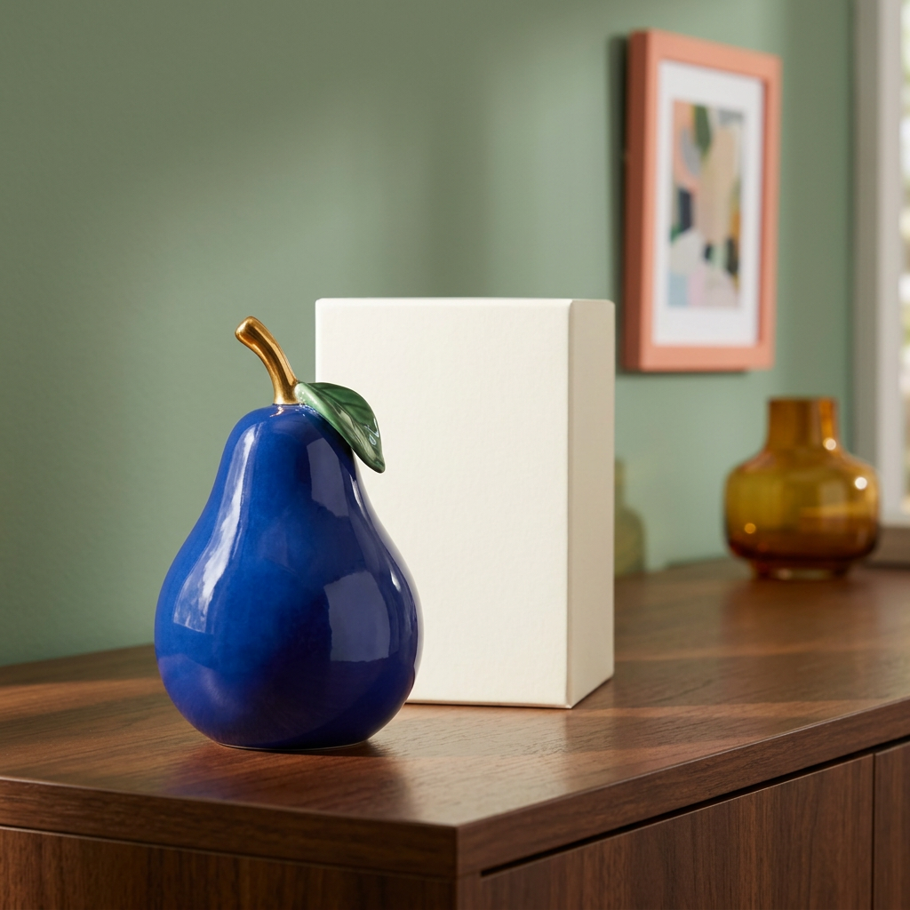
Orchard Nocturne Cobalt Blue Pear Sculpture with Gold-Tone Stem & Emerald Leaf — An Artful Accent for Expressive Interiors
Orchard Nocturne Cobalt Blue Pear Sculpture with Gold-Tone Stem & Emerald Leaf — An Artful Accent for Expressive Interiors
Couldn't load pickup availability

Orchard Nocturne Cobalt Blue Pear Sculpture with Gold-Tone Stem & Emerald Leaf — An Artful Accent for Expressive Interiors
🍐 Familiar Shape. Unexpected Color. A Different Kind of Still Life.
A pear belongs in an orchard. Cobalt blue belongs in a painter’s palette. Put the two together, and something wonderfully unexpected happens: a familiar silhouette becomes a piece of visual conversation.
Orchard Nocturne is a decorative sculpture concept built around that contrast. A deep blue body rises from a rounded lower form into a gently narrowing neck. Above it, a curved gold-tone stem catches the eye; a single green leaf adds a final botanical note. There is no printed slogan to explain it and no busy pattern to compete with the shape. The idea is simple enough to understand at a glance, yet distinctive enough to invite another look.
For interiors that feel a little too predictable, this is a new direction to explore. Not another neutral ornament. Not a miniature copy of something already on every shelf. Just an everyday fruit reimagined as a rich, sculptural accent.
🖼️ Read the Design Like a Small Work of Art
First, the silhouette.
The pear’s generous lower curve gives the composition its visual center. The narrower shoulder draws your eye upward, while the bent stem interrupts the symmetry with a small, expressive gesture. Set against the straight edge of a cabinet or the vertical line of a book, that organic outline becomes especially noticeable.
Then, the color.
Cobalt is the main event: saturated, cool and confident. It brings contrast to warm timber and stands apart from cream, oatmeal and soft gray. The green leaf keeps the palette connected to nature without trying to imitate an actual piece of fruit. The gold-tone stem provides a warm accent rather than covering the entire sculpture in metallic color.
Finally, the light.
The concept images show a glossy-looking blue surface with broad highlights that follow the curve of the body. Those reflections make the form easy to read, particularly beside quieter textures such as linen, paper and unfinished-looking wood. The imagery illustrates a finish direction, not a verified material specification.
🪞 The Stylist’s Notebook: Choose Your Contrast
- Gloss beside softness: try the sculpture near a linen-covered book, a woven lampshade or a matte picture frame. Changing the texture is often more interesting than adding another bright color.
- Curves beside geometry: a rectangular frame or a low stack of books helps the pear’s rounded profile stand out. Give each shape enough separation to remain visible.
- Cool blue beside warm wood: walnut, honey-toned oak and terracotta backgrounds create a strong visual counterpoint to the cobalt body.
- A small metallic echo: if you already have a brass-colored frame or lamp detail, let the stem make a quiet connection. There is no need to add a whole collection of gold accessories.
The most useful rule is restraint. When a decorative object has a recognizable silhouette and a saturated color, the space around it becomes part of its presentation. Try removing one neighboring accessory before buying another.
🛋️ Three Rooms, Three Different Personalities
01 / The Collector’s Living Room
Picture a walnut console, a terracotta wall and the edge of a teal chair. The blue pear brings a cool focal point into the warm arrangement. Place it where the silhouette is visible from the main seating area, rather than hidden behind taller objects. A simple print nearby can repeat one supporting shade without turning the room into a coordinated set.
02 / The After-Dinner Sideboard
On a dining room sideboard, the fruit-inspired form gives a subtle nod to the setting without becoming tableware. Burgundy, ochre and cream provide an expressive backdrop. Keep serving space separate from the decorative arrangement, and do not treat the sculpture as a food container, serving accessory or heat-resistant object.
03 / The Creative Workspace
A work corner does not have to look like an equipment shelf. Against a sage wall, cobalt can introduce a clear point of contrast. Pair the sculpture with one abstract print or an amber-colored vase, leaving the practical work surface uncluttered. Choose a position away from the edge and outside the path of cables, sleeves and frequently moved items.
🧭 Find the Right Spot Before You Fill It
Instead of asking which empty space needs an ornament, ask where you want the eye to pause. A console seen from the doorway, a bookshelf at seated eye level or a sideboard beneath a favorite picture can be more effective than a corner that is simply vacant.
Look at the background as carefully as the surface. Against white, the silhouette feels crisp and graphic. Against green, the blue body feels more jewel-like. Against warm reddish tones, the color contrast becomes stronger. None of these approaches requires you to change the entire room; sometimes moving the object from one existing surface to another is enough to discover the better arrangement.
Before choosing a final position, compare the confirmed physical dimensions with the available depth and height. The lifestyle images are styling illustrations, not measurement diagrams, and should not be used to estimate exact scale.
📦 A Quiet Packaging Direction
The gallery pairs the sculpture with a plain ivory rectangular box. Its visual role is deliberately understated: a pale, simple shape that lets the blue ornament remain the focus. The packaging concept has no logo, no printed wording, no decorative ribbon and no competing pattern.
The same box direction is carried through the gallery rather than changing the packaging to suit each scene. In a real room, you could store packaging separately after unpacking; its repeated appearance here is intended to show a consistent presentation concept. Actual box construction, internal protection and supplied packaging must be confirmed with the supplier before this draft becomes a sales listing.
📝 The Practical Details, Without the Guesswork
Design direction: one pear-shaped decorative sculpture with a cobalt blue body, a gold-tone curved stem and one green leaf.
Visual finish direction: a glossy-looking blue body, metallic-looking stem and detailed green leaf, as shown in the concept gallery. “Gold-tone” describes color, not precious-metal content.
Intended presentation: indoor decorative display on an appropriate stable surface. This concept does not establish suitability as a toy, bookend, paperweight, container or functional household tool.
Proposed packaging: a plain, unbranded ivory rectangular box. Scene furniture, books, plants, artwork and other styling accessories are not presented as part of a product set.
Still to be verified: material, measurements, weight, construction, surface durability, supplier care instructions and final packaging specification. No handmade, waterproof, scratch-resistant or protective-packaging claim is made.
🔎 Before You Make It Yours
Is the sculpture ceramic?
The images explore a glossy decorative finish, but appearance alone does not establish material. Confirm the actual construction before ordering or publishing a material claim.
Does it come in several colors?
This listing concept presents one color direction only: cobalt blue with a gold-tone stem and green leaf. Different backgrounds and lighting in the gallery do not represent additional color variants.
Can the stem or leaf be used as a handle?
No handling strength has been verified. Do not assume decorative attachments are load-bearing, removable or adjustable. Follow the actual supplier’s handling instructions once available.
How should I clean it?
Use the supplier’s confirmed care guidance for the final material and finish. This draft does not establish compatibility with water, detergents, polishing products or a dishwasher.
💙 Let One Unexpected Object Set the Tone
There is a difference between filling a room and giving it character. Character often comes from the thing that breaks the pattern: a saturated blue beside warm timber, an organic curve beside a straight-lined frame, a familiar fruit that looks as though it escaped from a still-life painting.
Orchard Nocturne explores that playful space between everyday recognition and artistic surprise. Keep the surroundings simple, choose a background that lets the silhouette speak, and let one sculptural detail introduce a new mood.
Give your interior a bolder point of interest.
Draft concept disclosure: The product design, packaging and all eight gallery images are AI-generated visual concepts, not photographs of a verified stocked item. Confirm the actual product, dimensions, material, finish, care requirements, protective packaging and availability before publishing or accepting orders. Minor rendering and lighting differences can occur between concept images.